I’m lucky enough to have some hidden skills in Adobe Photoshop, and they’ve become quite useful every now and again on the Blake Archive. Photos of manuscripts, though high resolution, still present visual challenges when it comes to identifying near-invisible features like erasures, corrections, and other odd quirks. And while we’re trained to be extremely observant and thorough when analyzing a manuscript, the magic of image-processing software can give us an advantage.
Photoshop and other Adobe programs are not exactly user-friendly, so I won’t take up the blog post by outlining all my processes, but if you know your way around the program, you may recognize them as pretty simple! My goal is to show off the difference a little contrast and color-adjusting can do when trying to read less than clear portions of a manuscript. And one or two unexpected surprises that can pop up in editing…Blake holds many mysteries.
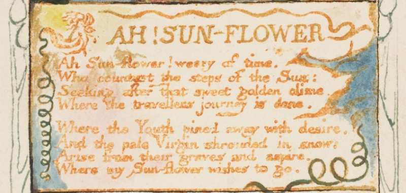
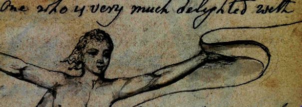
I recently worked on the Archive’s publication of Blake’s signature in Upcott’s Album. It’s a fascinating object and a fun vignette of Blake’s personality, so if you haven’t checked it out, click here!
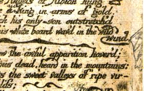
Blake first outlined the header portion of his signature and the accompanying image in pencil before tracing it in ink. We decided to explain this in an object note and include a couple of close-up clips that demonstrated this to readers. However, these pencil lines are very faint, especially if you don’t know what you’re looking for. I knew some mild editing would help; I increased the contrast and used a few filters so these lines would become more visible.
Here, his pencil strokes are much more present and we can see the underlying plan he initially sketched. But, while the previously faint lines come forward, so does the “noise” of the paper texture. This can defeat the purpose of additional clarity, and it might take a few adjustments to get the type of contrast that’s just right.
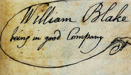
While not perfect, this image is perhaps the best of both worlds—heightening those faded strokes without losing too much of the original image’s integrity.
Upcott wasn’t the only publication where Photoshop worked its magic. A revised plate from America A Prophecy had corrections hand-written by Blake which were difficult to make out.
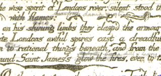
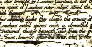
Again, the “noise” issue is a little problematic here, but the contrast helps us read Blake’s corrections a lot better. This revised plate is not yet published on the Archive, so stay tuned!
Now, I did mention something about mystery and surprises. After I edited the Upcott photo, I noticed that there appeared to be erased text beneath the image Blake drew.
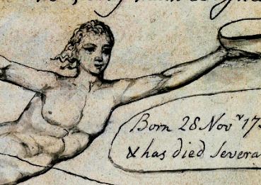
If you look at the figure’s face as well as to its left and right, you’ll see the faint imprint of lines of text. They were too faded to be readable no matter what I did in Photoshop (that pesky paper grain!) but I suspect that the text’s content is the same as the visible lines; Blake just decided to change his layout. Still, it’s always exciting when you see letters that weren’t there before!
Alright, so that was more the surprise, and this is more the mystery. I don’t know if you caught it—but take another look at the darker contrast clip of the Upcott manuscript; there is a strange, angular shape beneath the text. My curiosity got the better of me, so I went a bit extreme with the editing…
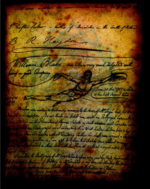
And this curious star-like frame appeared! This edit is more than just contrast; I added some fancier layers to pick up on that background shape. Without these edits, it’s virtually invisible in the original image.
Not to kill the anticipation, but sadly, it is not a previously undiscovered or lost-to-history work of Blake. The shape seems to have bled through from underneath Blake’s signature page, so in all likelihood has absolutely nothing to do with Blake. At first, I figured it was on the next page, but that would mean the text within the shape (look behind Blake’s figure) would be mirrored and it doesn’t look like it is. It must be from the page after that—which is some pretty strong bleed-through.
I teamed up with another Archive member to do a little digging. The album is held at the New York Public Library, but Blake’s page is the only one they have digitally uploaded to their site. Without a trip to NYC, there’s no knowing for sure. Since Blake’s autograph is part of a collection in this album, I’m more than curious to know whose grandiose signature this is. Or, perhaps it’s a hidden occult message? What’s your guess?