Majoring in both English Literature and Computational Linguistics and enrolling in Linear Algebra for my personal pleasure, my undergraduate career is best described as idiosyncratic. Creating a project through the Blake Archive presented me with an abundance of options at the intersection of my two major fields but I decided to experiment with a realm I am less than familiar with: color theory.
Computational color analysis is a field emergent, still somewhat sparse on literature, and mostly relegated to developing computer vision, medical imaging, and forgery detection programs. A few fantastic articles computationally analyzing the color of visual artists have emerged, but as far as I was able to uncover, none for William Blake himself. This is the portion where I am both working and stuck; the realm of Blake and Color is vast in possibilities, particularly those lent by ever-advancing, open-source image analysis packages, and limited in my own knowledge, skill, and time.
Mean Intensity
Thus far, a fair amount of this project has been an exercise in vocabulary building. I was certain that I knew what brightness and intensity and contrast were and while I was not wrong, I was not exactly right either. One of the many tangents I have followed in the course of this project is attempting to measure the overall darkness of Blake’s illuminated works over time. A quick skim over the general palettes of copies A-I of The Marriage of Heaven and Hell supports the theory that Blake’s colors became darker over the years, moving away from the softer pastels. To attempt to measure this, scientifically, of course, I decided to chart the mean intensity value of each copy.
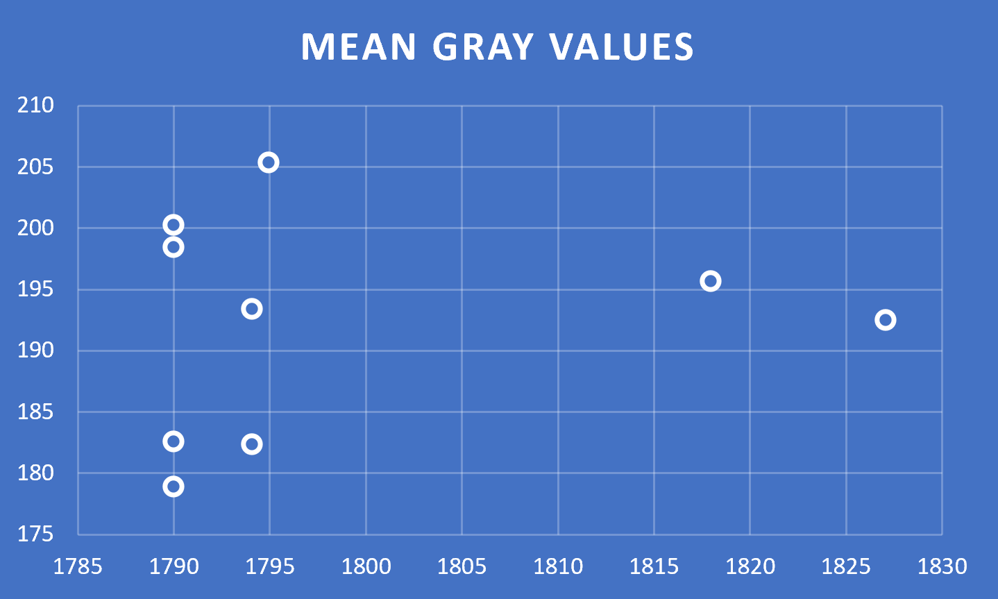
An intensity value from 0 to 255 measures the overall grayness of a given pixel, with 0 being the darkest and 255 the whitest. The mean intensity of an image, which I used the python scikit-image toolkit to find, averages the intensity value over every single pixel in the image. Then, averaging these means again, I could plot the mean intensity not for each image, but for each copy.
The results were, at best, inconclusive. I am left questioning whether I should clean each image of any large text section, however the color of the ink and paper contribute to the overall aesthetic of each image as well. I further question whether the results may sharpen as I add in more copies of more works, or if I will still be left with a scatter plot and no line of best fit.
The Color Space
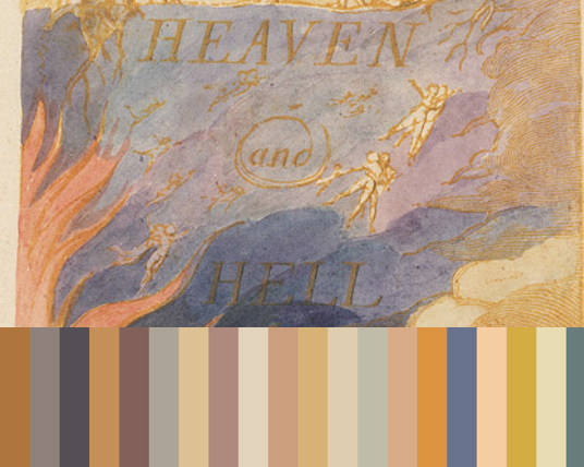
The Marriage of Heaven and Hell, Copy A, Object 1, with generated palette 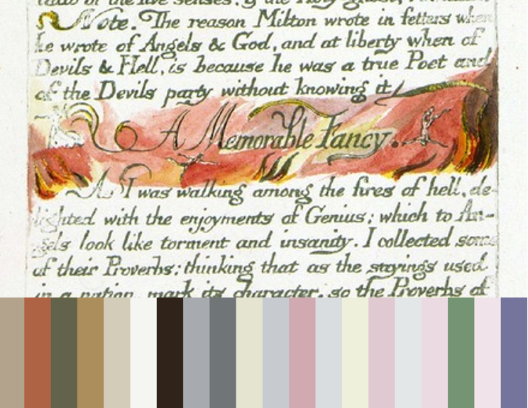
The Marriage of Heaven and Hell, Copy D, Object 6, with generated palette
When I first began looking at Blake’s color use, I wrote a python script using colorthief to visualize the top twenty colors in each image, and the results can be as aesthetically pleasing as confusing, taking the two sets above as examples. One of the most difficult portions of computational analysis is not only needing to trust your code, but needing to trust that the code might be able to see what you cannot.
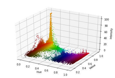
The Marriage of Heaven and Hell, Copy A (1790), Object 1 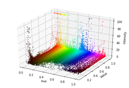
The Marriage of Heaven and Hell, Copy D (1795), Object 1 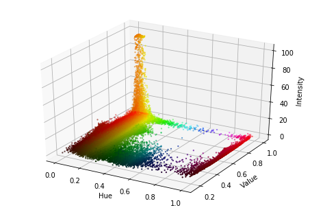
The Marriage of Heaven and Hell, Copy E (1794), Object 1 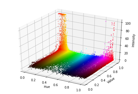
The Marriage of Heaven and Hell, Copy G (1818), Object 1 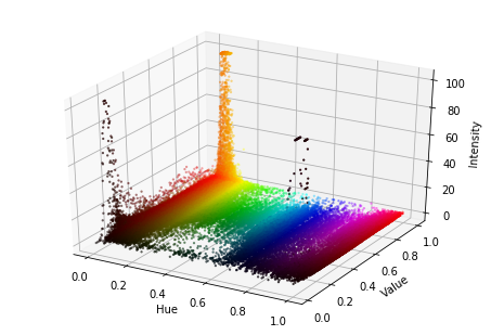
The Marriage of Heaven and Hell, Copy I (1827), Object 1
Modifications on this program allowed me to view the color space (more or less) for each image from a given work, and the set of images immediately above demonstrate some of the color spaces of Object 1 of The Marriage of Heaven and Hell across the copies and over time. The shifting of color spaces almost certainly contains some hint of information about Blake’s evolving style, but I have yet to find much that is statistically concrete.
Next Steps
As stunning as the engravings are, I cannot help but worry that analyzing his color palette without the accompanying text loses a connection that is at the core of Blake’s work. So, here I am presented with yet another dilemma. How can I connect Blake’s visual art with his writing during my computational analysis?