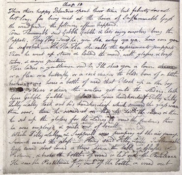
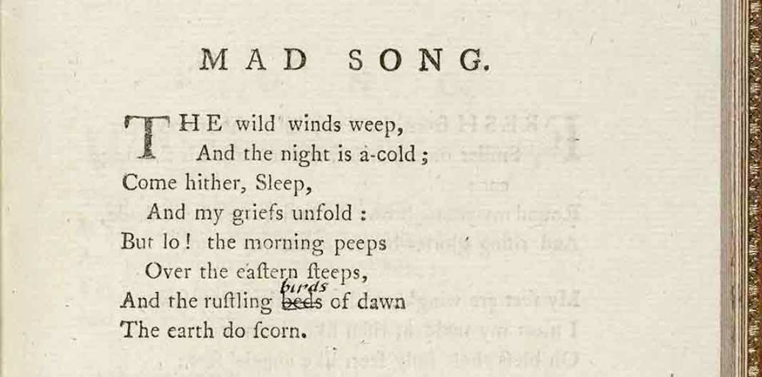
Sometimes in archival work, you find yourself on these “side quests,” tracking down a paradoxically indispensable yet trivial bit of information. Such a quest came up after the last round of receipt proofing. A member of the Archive noticed that a handful of the receipts had watermarks with a range of visibility. Receipt number 26 had a particularly faint watermark that evaded straightforward identification. As this information—when present—is typically included in the publications, it was necessary to figure out if this watermark was visible enough to describe.
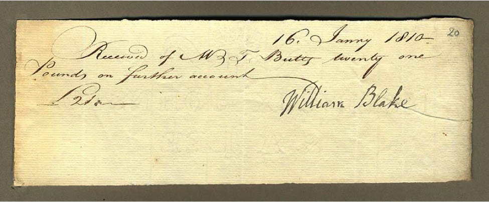
(16 January 1810, Object 1 (Bentley Receipt 26), 7.5 x 21.0 cm. ©)
When the puzzle was posted to Slack, (the app BAND uses to communicate about current projects or everyday issues) most of the watermark was discovered to read “Johnston & A. Lee.” Problematically, Blake’s signature obscured the first word/name preceding Johnston. A few of us were trying to work it out, but we were not getting anywhere very quickly. So, we did what we often do when we can’t figure something out: we send the issue to our internal list-serv, “blakeproj,” which consists of editors, project coordinators, and project assistants. With multiple eyes on the image, different members deciphered an “M,” an “O,” an “X”…Someone on blakeproj fittingly dubbed the process a game of hangman, as we tried to surmise what letters could fit between the ones that were legible.
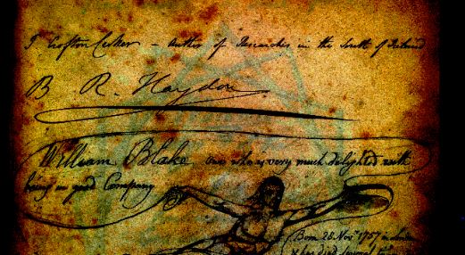
Having a few minutes, I decided to run it through Photoshop and see if I couldn’t get more contrast. I’m more knowledgeable about the painterly side of Photoshop than its photo-editing capabilities, but I had a few ideas in respect to filters and layer mode combinations that might help. First, I made a duplicate layer of the original image and inverted the colors via one of the filter tools. I then used a layer mode that simultaneously upped the contrast and made that negative image translucent. I placed the altered duplicate layer over the original image, which resulted in the highlights and shadows taking on these useful and aesthetically pleasing contrasting colors. The word beneath Blake’s signature begins to come forward from the textured paper:
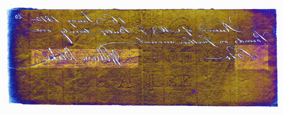
It was a bit of an experiment, but it worked! Sort of. I could definitely trace out “M O _ I N _ U X,” which confirmed what everyone else was seeing. But the third and sixth characters seemed capable of morphing into a couple of different letters. I’d been staring at this thing for way too long.
Back on blakeproj, Joe Viscomi had suggested finding a book on watermarks that would have names of contemporaneous paper-making companies. As I still didn’t have the complete name, I decided to do a simple Google search looking for paper makers using the watermark’s two readable names. I quickly got a hit in Jane Austen’s Letters, edited by Deirdre Le Faye, which lists watermark details for the letters: Molineux, Johnston and A. Lee was a paper making company in Sussex. I was pretty thrilled to have a clear match—Google searches are rarely so on point!
As neat as it was to mess with imaging software, I pretty much had all the information I needed to solve the case…the entire time. But hey, why not take the long, scenic route? And thanks to my excessive thoroghness, at least I had concrete evidence that confirmed the elusive name:
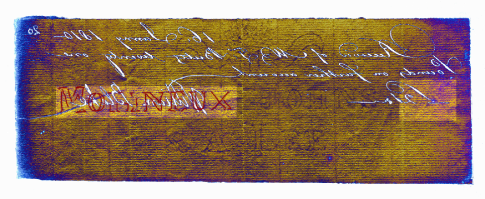
Moral of the story: Google first, Photoshop later. Unless, of course, you’re a master procrastinator in need of a break from homework.
For readers’ convenience, receipts 17, 19, 20, 26 and 29 have their watermark specifications under the “Receipt Information” tab.

