The project that I am currently working on for the William Blake Archive is the Descriptive Catalogue of Blake’s work for his exhibition in Soho in 1809. This is a new experience for me, because it is my first time working on a typographical work instead of a manuscript. With new experiences come new challenges, and new headaches!
The Descriptive Catalogue, talked about in previous posts on our blog, gives a description of Blake’s works for sale as well as a defense for his artistic choices. I’ll be honest: this printed Catalogue is not the most visually pleasing work we will have on the Archive, far from it. The lack of illustrations that we love from Blake, combined with an imperfect print job, makes the Catalogue difficult to work with. As we try to create a digital representation of this typographical piece, we as a group are running into many questions about how to handle this type of document. The biggest question we keep returning to is how to handle writing and marks on the page that we assume are printer’s marks, and not necessarily of Blake’s particular choosing? We believe we owe it to the scholars using our site to distinguish what we consider Blake’s work from non-Blake choices or contribution. Below are examples of things we might consider extraneous to the actual text:
Header and Page Number
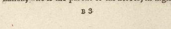
Printer’s Mark at Bottom of Page
We are currently discussing how to distinguish printer’s marks from what we would call Blake’s text. This can be done with a color code system, similar to how our unclear text currently works on the Archive. If you don’t know, unclear text within a work is coded as such so that it shows up as grey text instead of the default black text. This tells anyone looking at our transcription that the grey text is text that is unclear and may be interpreted more than one way. If we used this type of system for running titles or page numbers, someone looking at our transcription would be able to instantly see the difference between what we would consider the actual work and the printer’s marks.
Likewise, there are several instances in the Descriptive Catalogue of things we read as typographical errors made by the printer, i.e. misspellings, lack of spacing between words, extra marks on the page, etc. As we all know from looking at the letters of William Blake, Blake was never one for conventional spelling or punctuation. Though we can make assumptions that certain things in a typographical work are mistakes by the printer, we can never be certain. In line with this, we never correct a work when we transcribe it, even a typographical one.
My least favorite part of working with a typographical piece is something called “deuglification”. It is exactly what it sounds like: we want our transcription to be less ugly when it displays online. Our standard for beauty is always the original work. As such, we try to preserve the lines and spacing. In a typographical work, we include any printer’s marks as lines and they get their own line numbers. Additionally, we include any horizontal lines that section off pages. We try to keep both horizontal and vertical spacing as close to the original as possible. This can be a very tedious process, because we must readjust the coding for the spaces within the digital document of our transcription. We are still in the process of discussing how to handle different font sizes. Font sizes not only show importance and should be preserved for that reason alone, but they also change the entire spacing of the page. In order to deuglify a typographical work we must take font size into account.
Despite my bellyaching, I am really proud of my team – Laura and Margaret – for all the work we have done towards the Descriptive Catalogue. Hopefully, the DC will be published with more typographical works within the next couple of years.
—