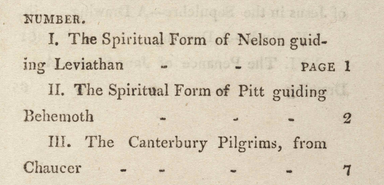
I have recently undertaken the arduous task of formatting the index to Blake’s typographical work, A Descriptive Catalogue. I say it was “arduous”, but I think I have only made it so. The text in question is fairly straightforward.
The main challenge is that the text is justified. We cannot simply encode it as justified because our display window is so large that the text would be stretched to undignified proportions.
Therefore, I justified the text to “left,” but had to finagle the right hand margins to line up. This was done in a silly way, by me, through adjusting the spacing between each of the pesky dash marks that you see above.
By the time I had ripped my hair out trying to align the right margin through this trial and error, I knew that there had to be a better way. This is when my dear colleagues here at the Blake Archive suggested I use a table format. A table would allow me to isolate the text of each line to a table row, which would have a designated width.
In the Digital Humanities, it helps to have friends that can see the obvious solutions you have overlooked.

